Wednesday, May 23, 2012
Look at her
The sign goes up! We may need to put something behind it because when the sun hit's it, you can't see a thing.
Almost time
The painters putting up the rest of the black chalkboard paint.
Subway tile that are size 6x8 with dark grout.
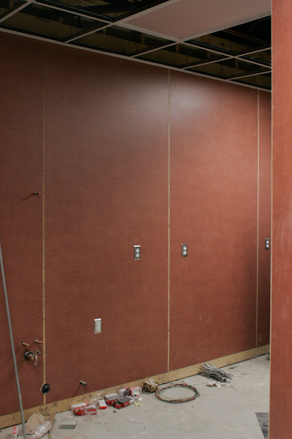
Our builder guy found this formica for super cheap and talked cubby into using it on the walls. We thought it was really ugly, but cubby was like why not? It's in the back. Then it went up and it looked like a chinese workout room. Ah man. We got them to epoxy over it with white paint.
Cub having a heart to heart with his contractor.
The bathrooms...already cute 50's look.
Cub's store in the works.
I saw the sign
This is what we're using for the front of the store with lightbulbs in it.
Cubby's logo is finished. Yipee! Kelly made the logo for us and we feel so lucky that we had her talented skillz.
This is the light bulb sign that we're doing. It's going to look a little bit like this with the brushed nickel. Baker's company, Yesco, is doing the sign.
Subscribe to:
Comments (Atom)


.jpg)
.jpg)
.jpg)
.jpg)
.jpg)
.jpg)
.jpg)


